99 Group is a leading real estate technology company that operates real estate portals across Southeast Asia.
Device
Native iPad App (accessible on M1 /M2 iMac and Macbook)
Role
Given the resource shortage and the heavy requirement for industry knowledge, I took on three roles simultaneously - Product Manager, Product Designer, and User research. The core team consisted of four members, including myself. The others were a backend engineer, a mobile engineer, and a data operator.
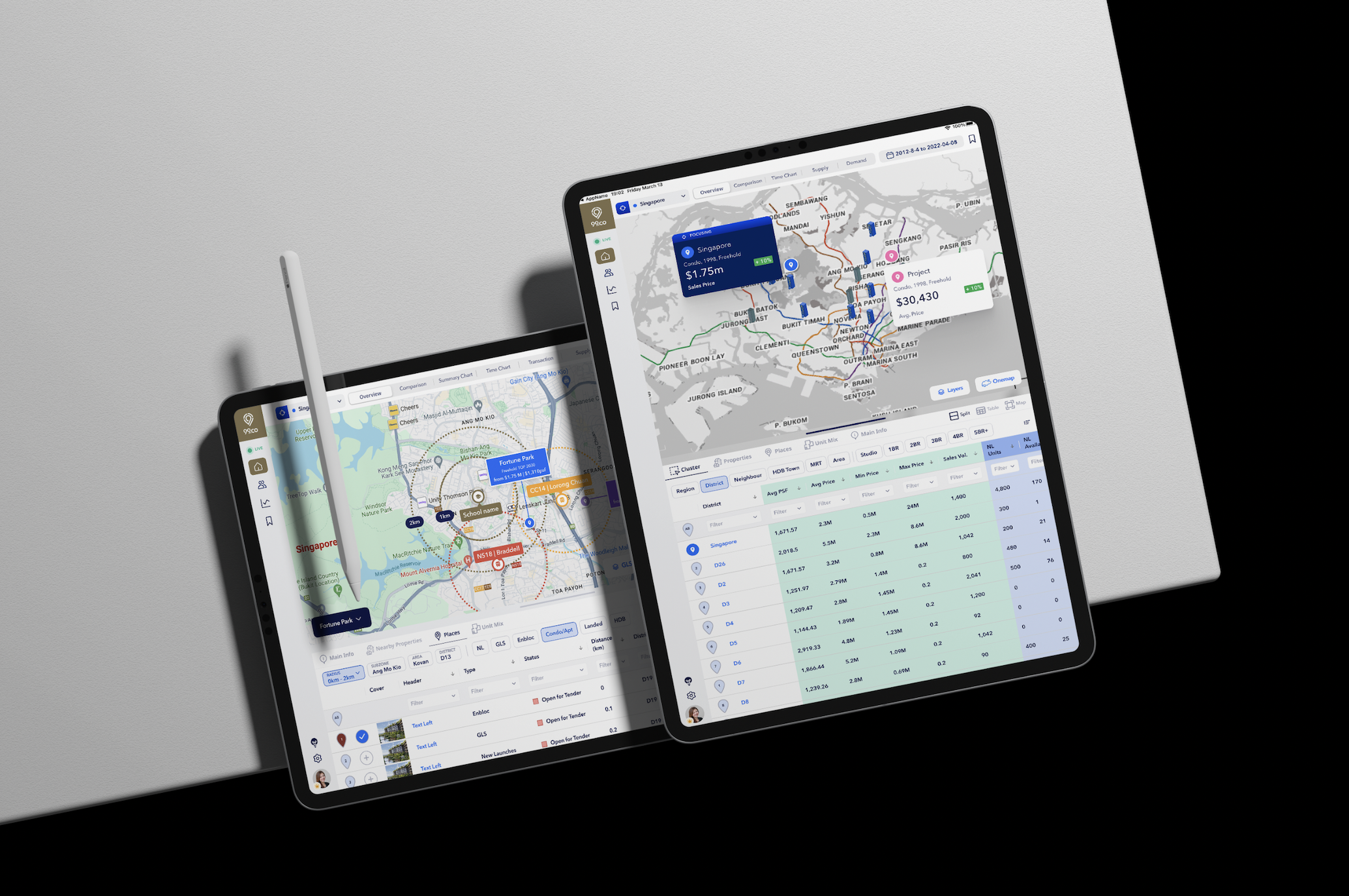
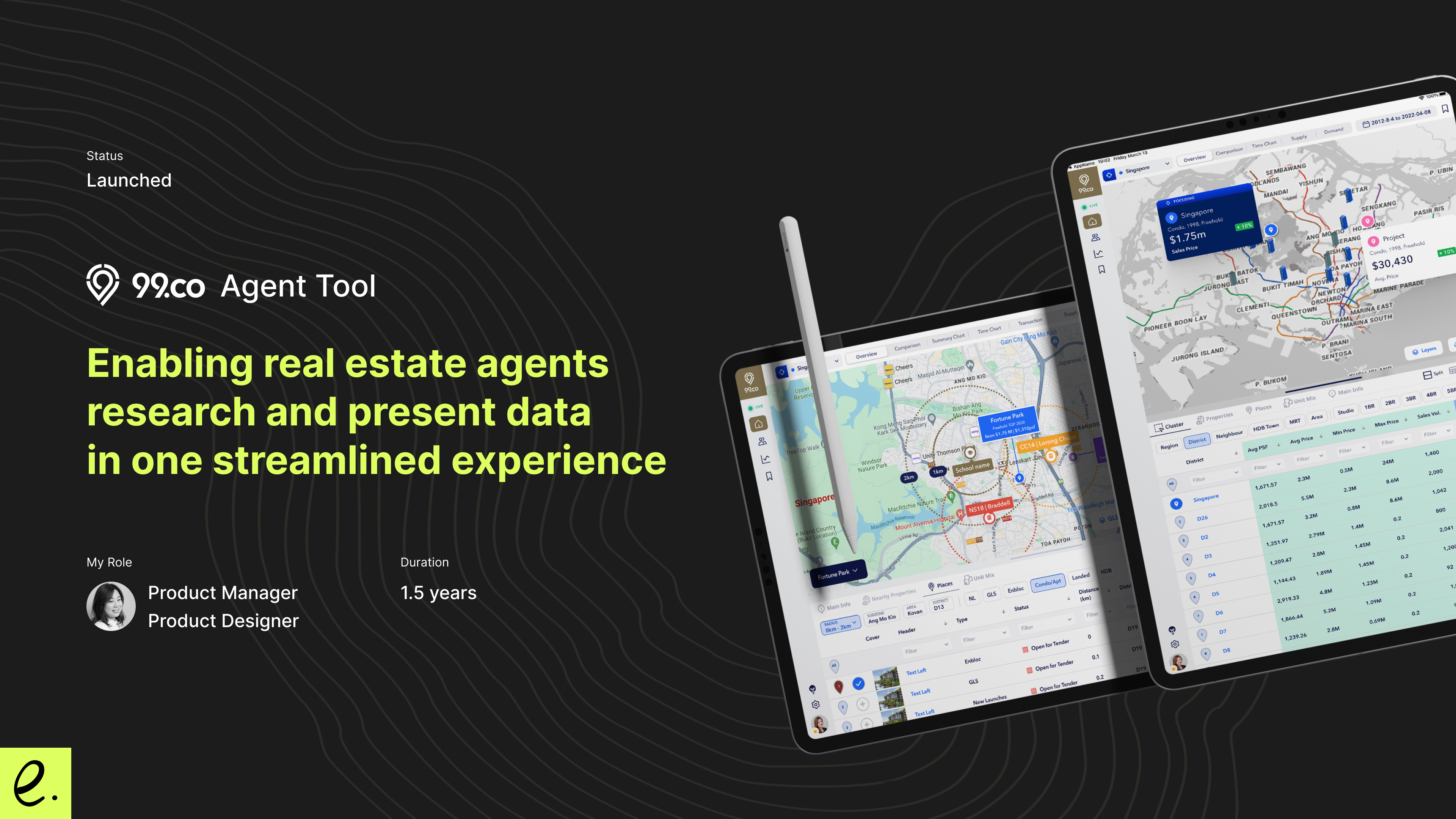
99.co has been running its business for a decade in Singapore by enabling buyers, renters, and owners to search property listings and access the latest transaction data. Since 2016, I began helping the company build nine different data products to assist agents in researching data. We decided to unify these nine different informative products into a single and cohesive experience, creating a powerful real estate pitching tool
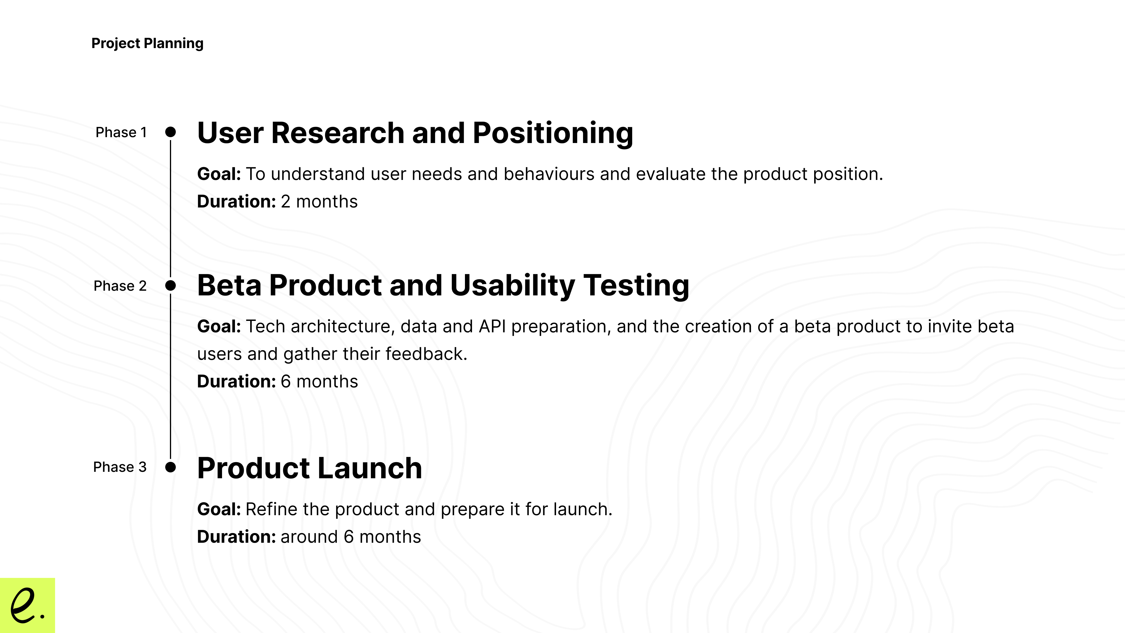
Phase 1: User Research and Value Proposition
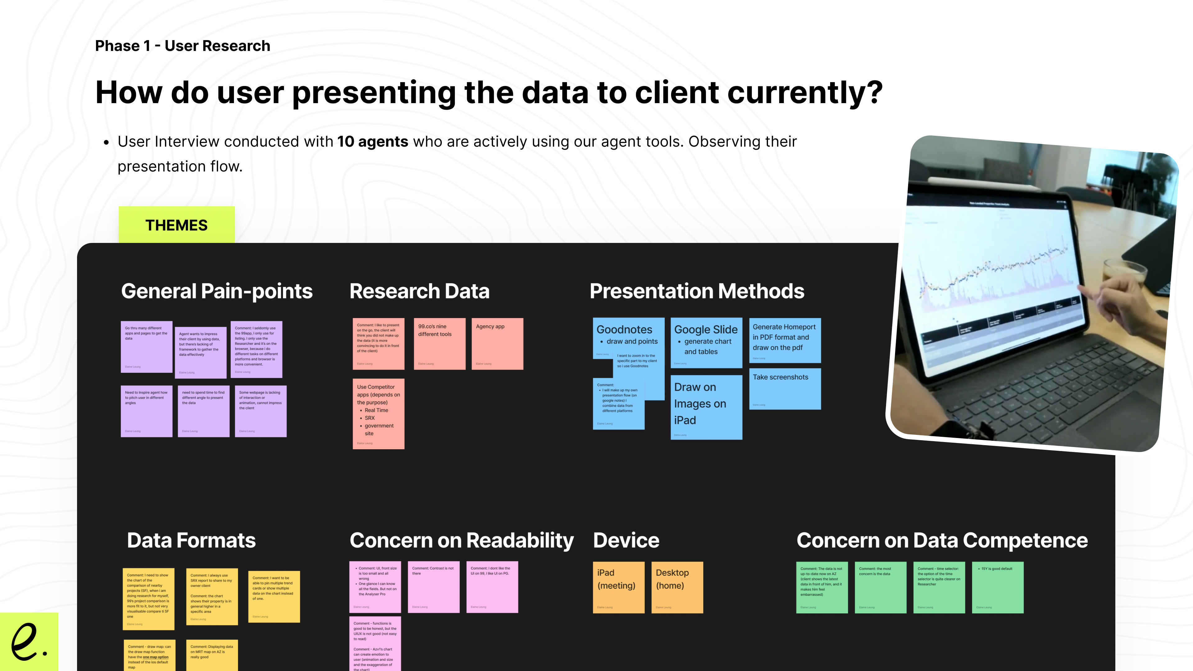
We started by interviewing 10 different agents who were the most active users of our data products to gather their insights and observe their daily workflow in researching data and pitching to clients. We set up a camera to capture how they operated their systems and provided them with a property buyer scenario. The agents walked us through how they used different apps and features to complete their tasks.
Key Findings
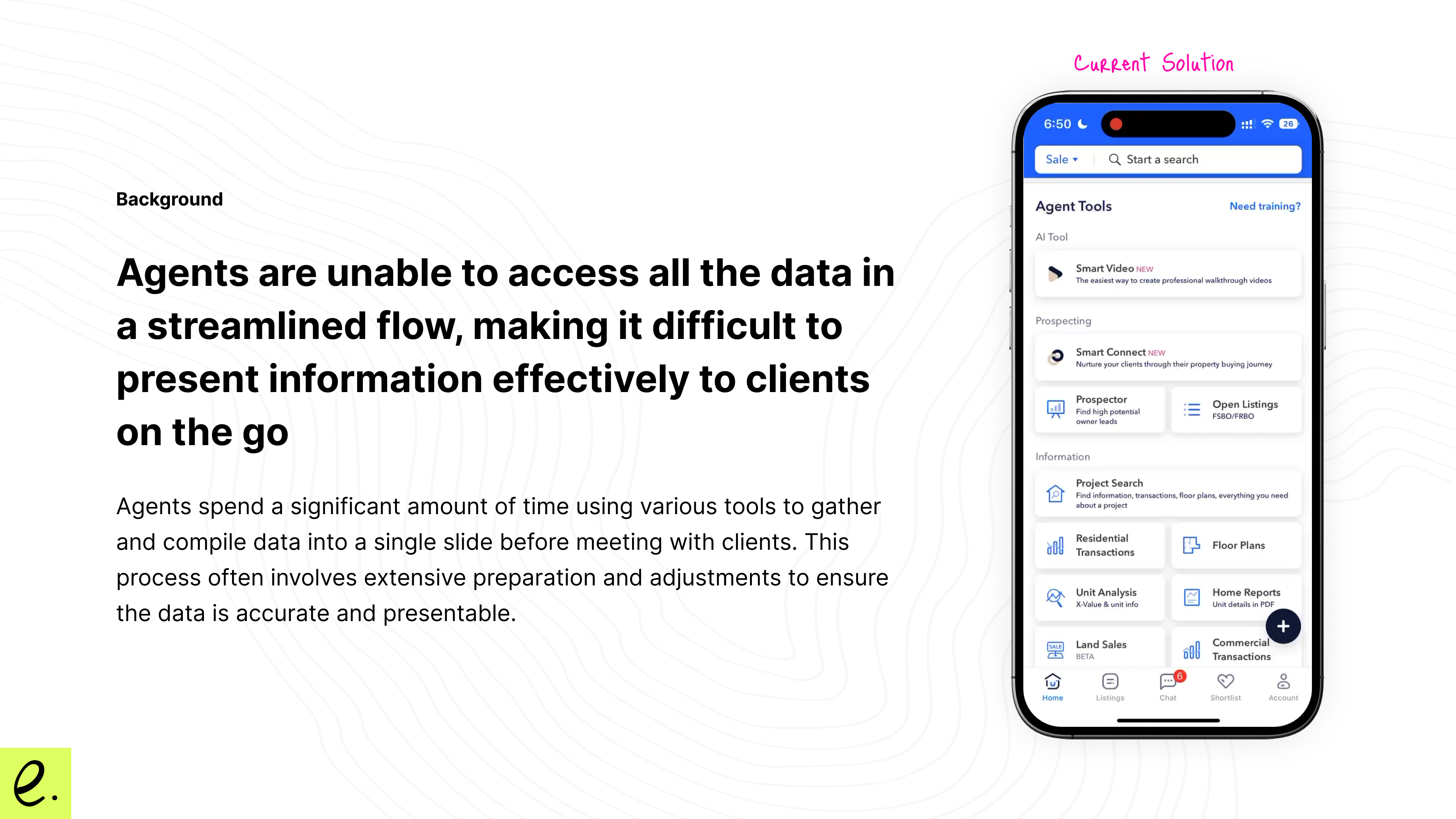
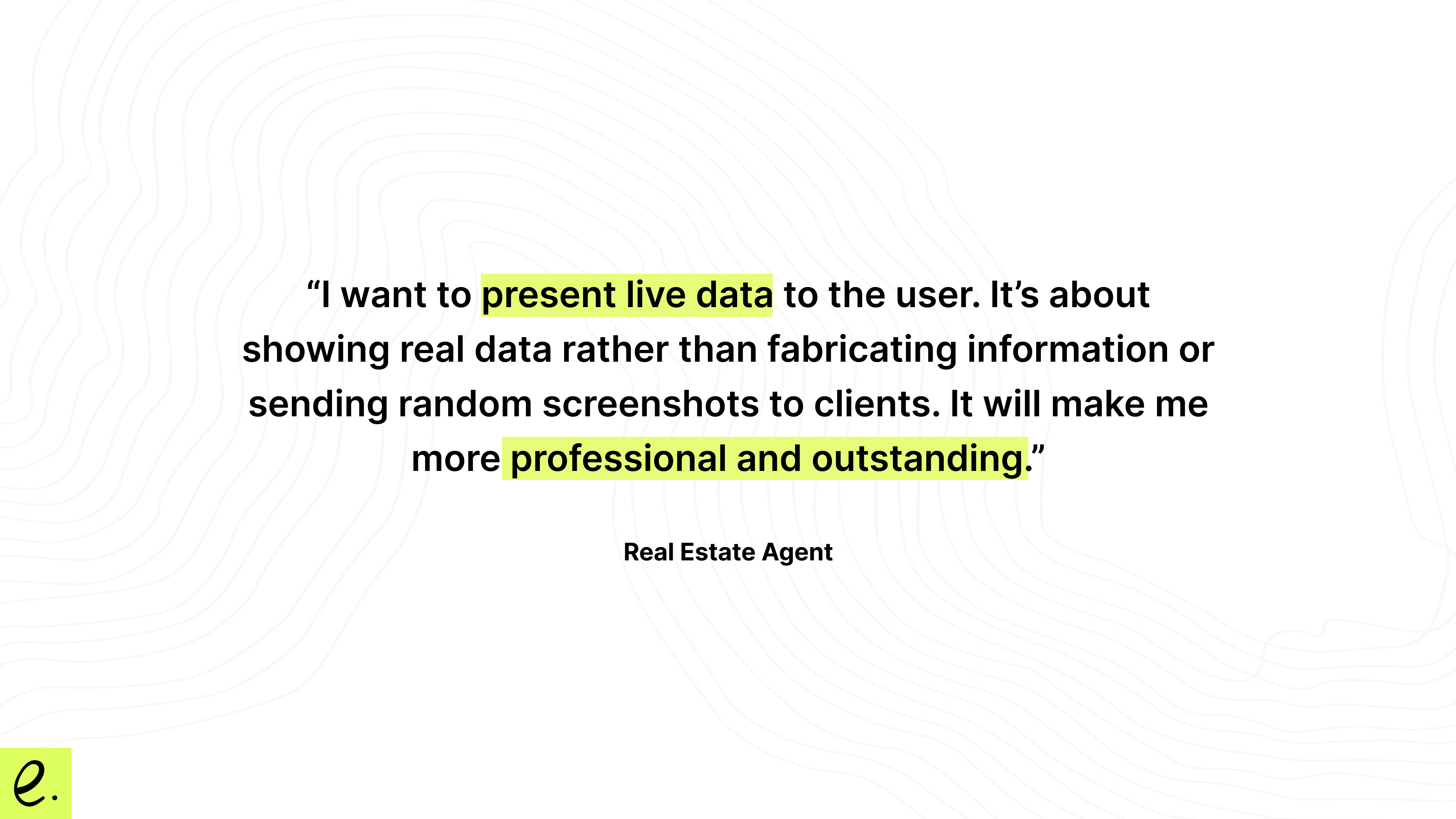
I observed that most agents use an iPad instead of a mobile app when presenting data to clients. While our existing mobile app is a good on-the-go research tool, it wasn’t built for presentation purposes.
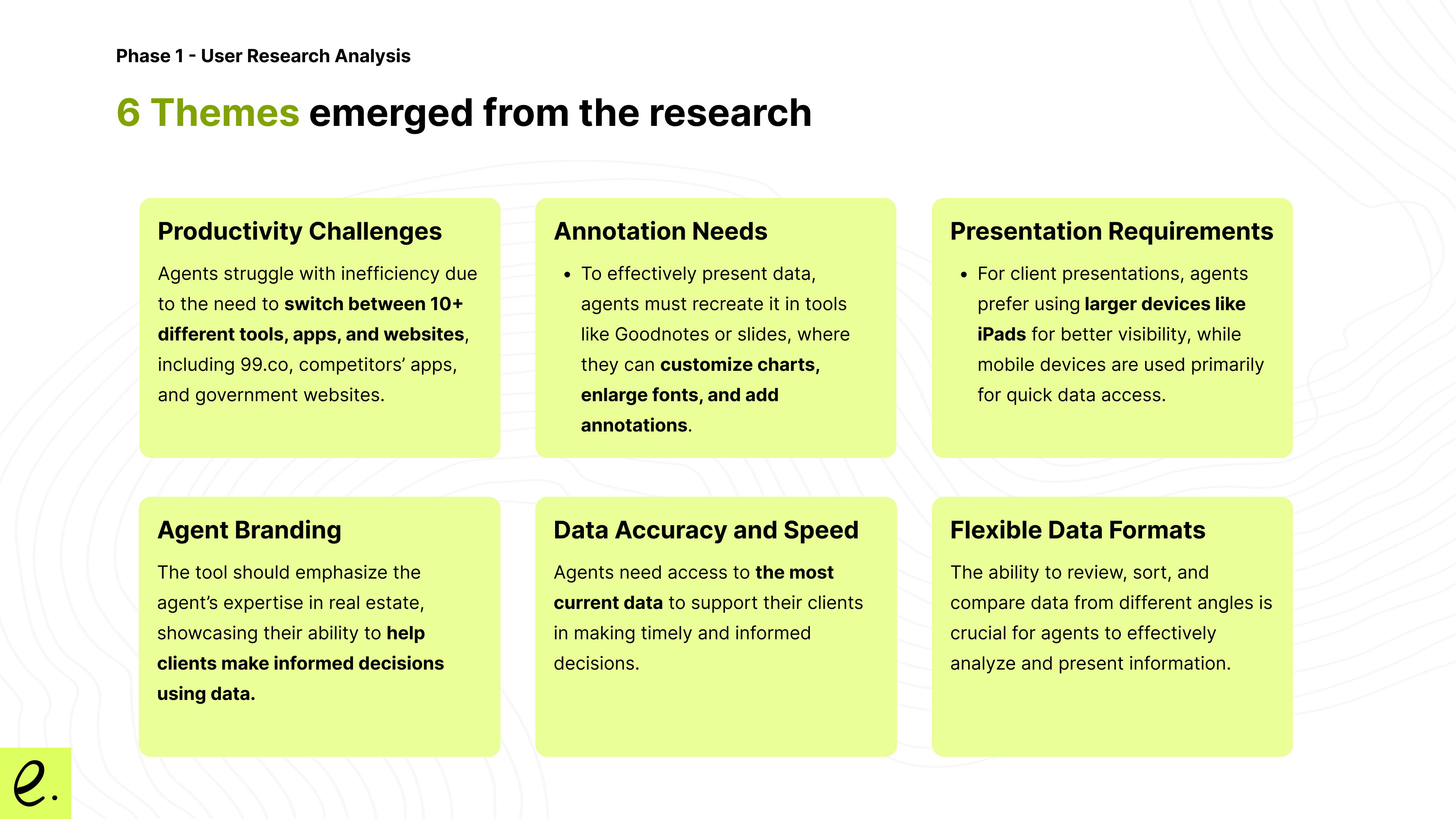
I also noticed that agents often switch between nearly 10 different apps and webpages to gather data from various sources.
They then take screenshots from these sources and compile them into Google Slides, GoodNotes, etc., to prepare for presentations. However, this process results in "touched-up" data, preventing agents from presenting up-to-date, live data to their clients.
These interesting findings laid the foundation for our product vision: A live real estate data presentation tool.
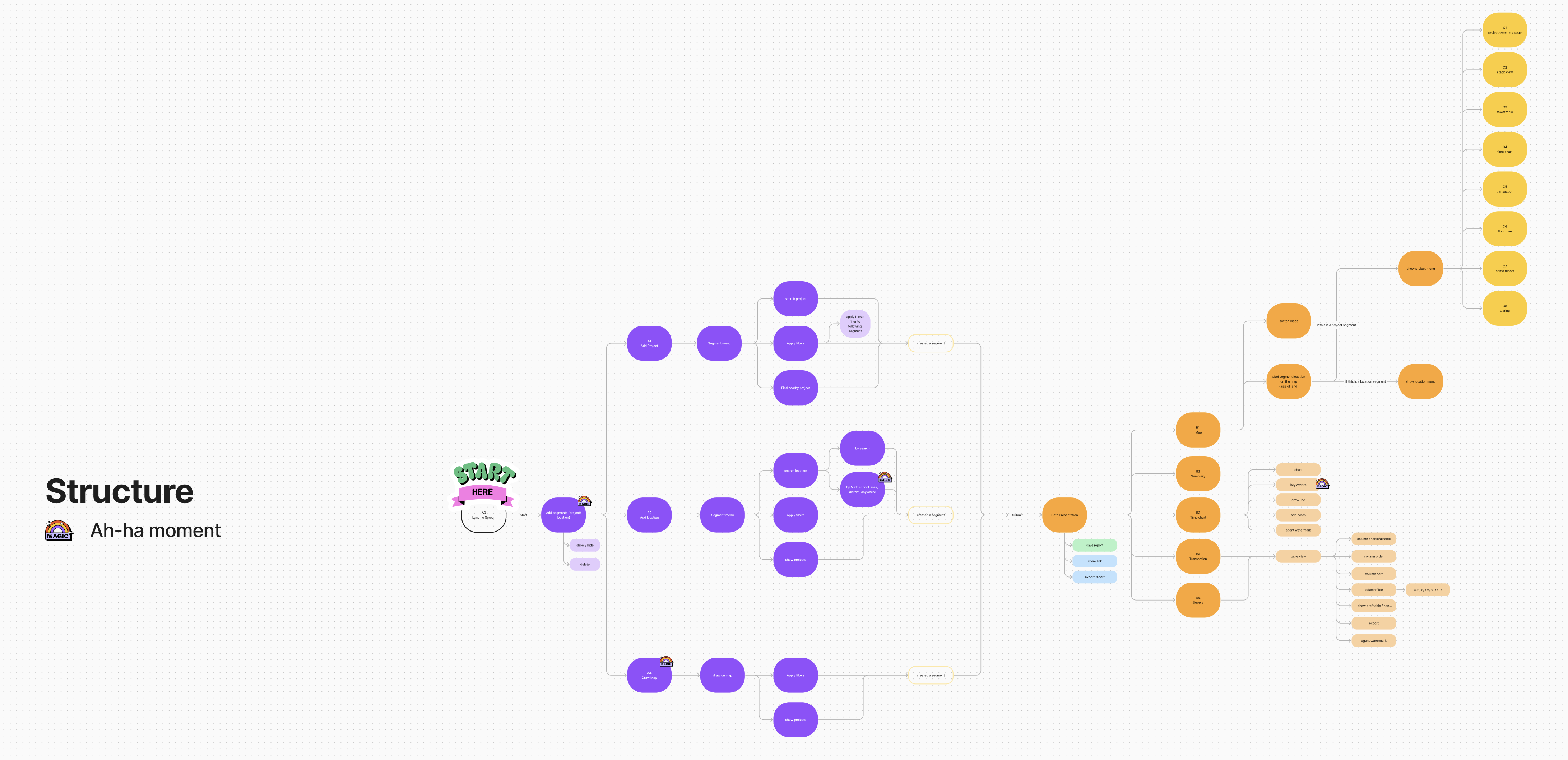
User Flow
After consolidated all the user feedback and observation, I then mapping the core features and function to a product flow and defined the “aha-moment”
Product Structure and Aha-moments
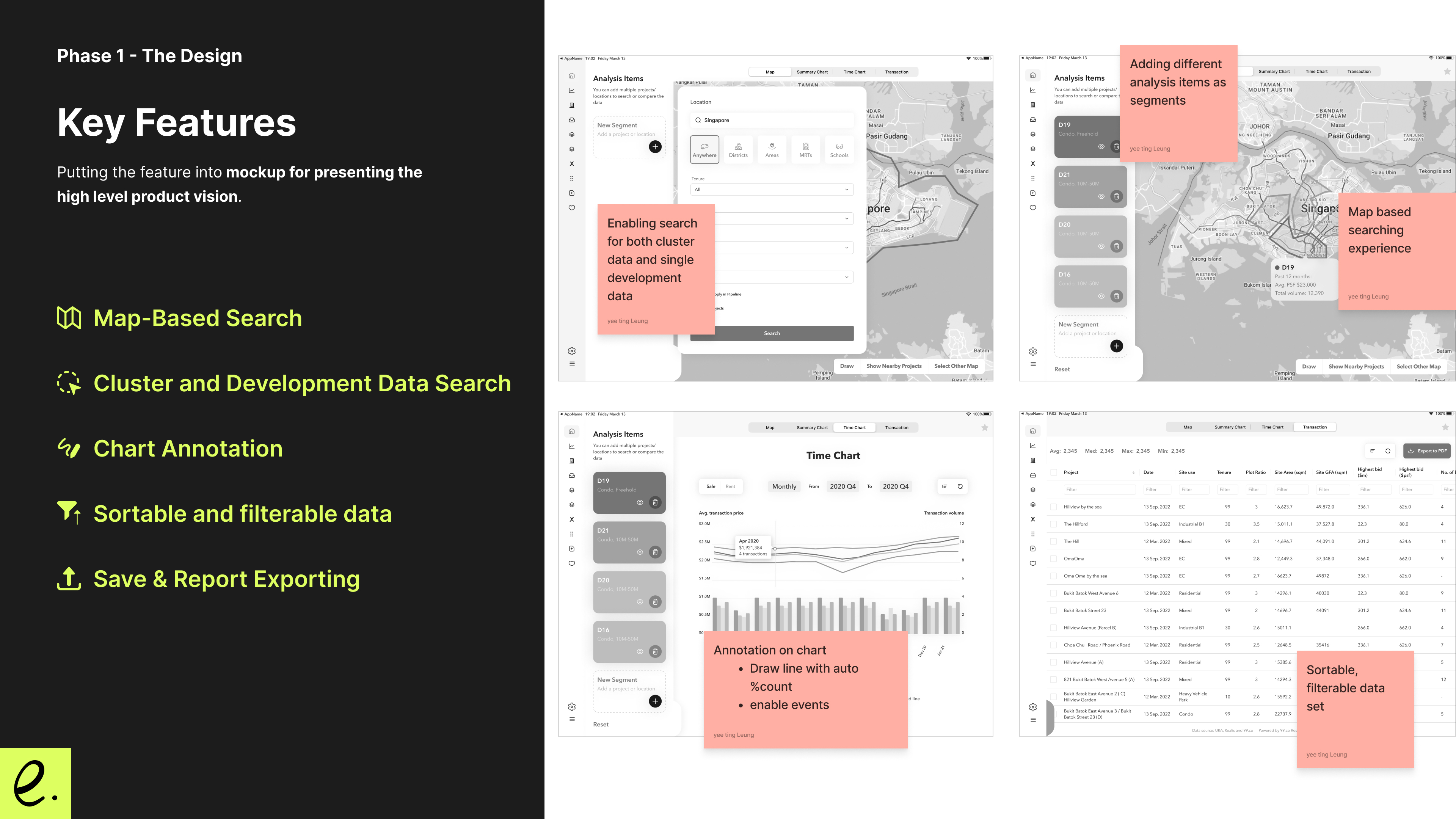
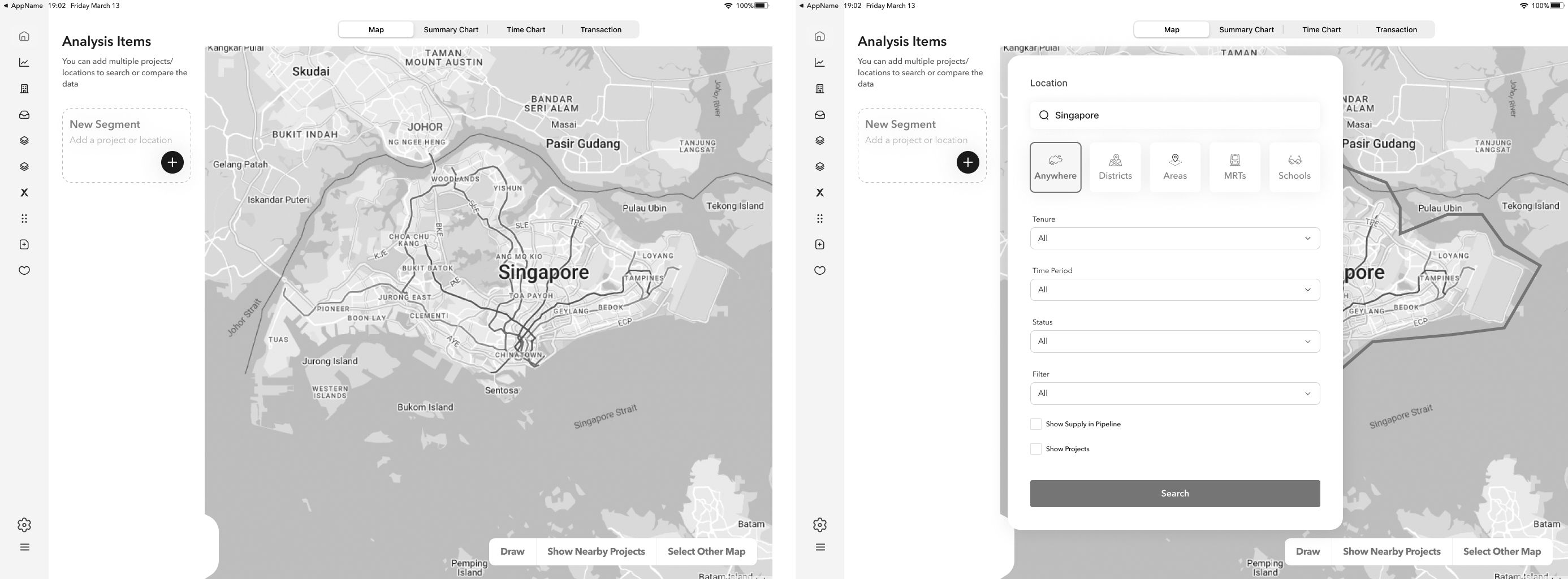
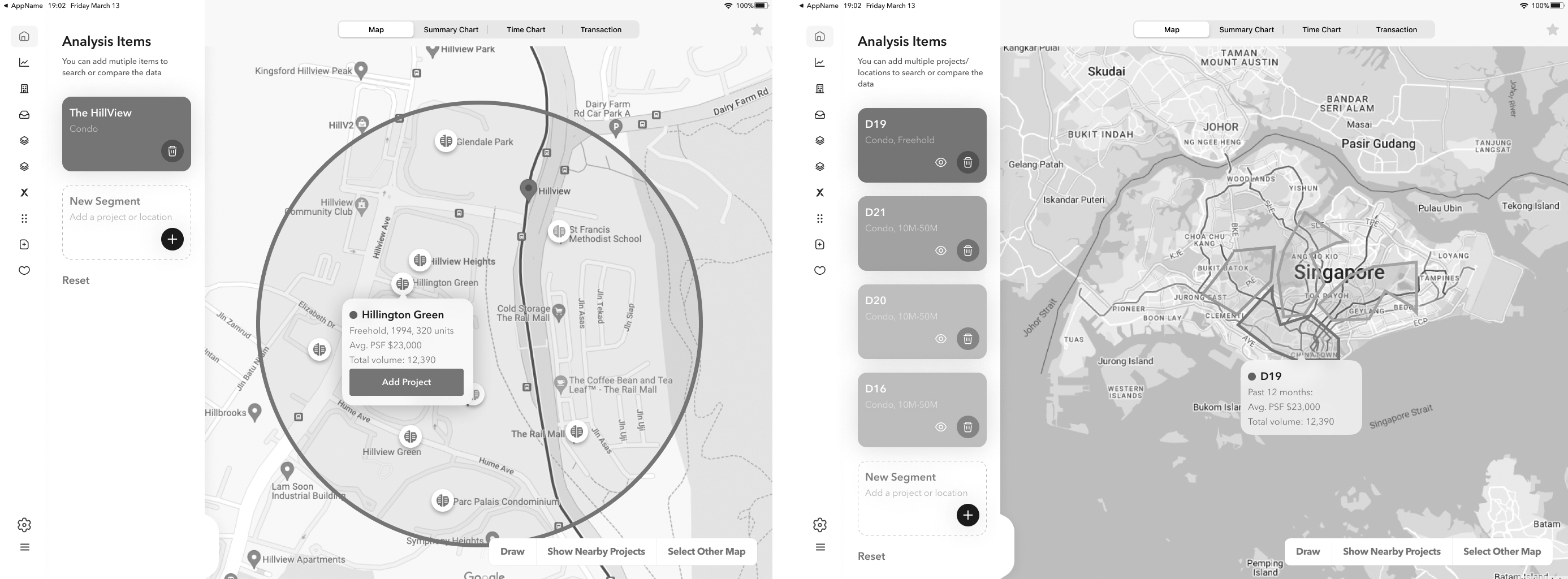
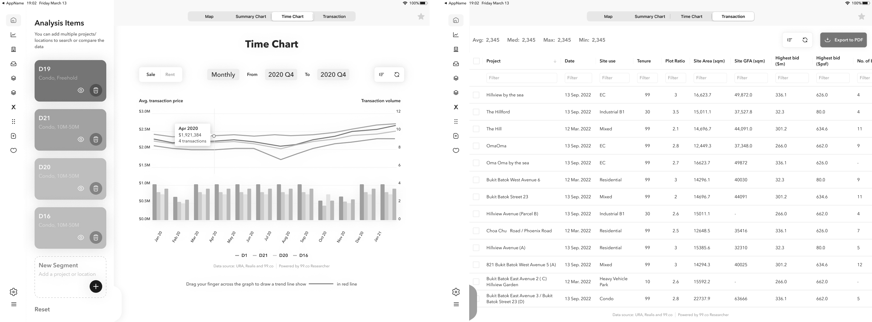
Key Features
Mock ups
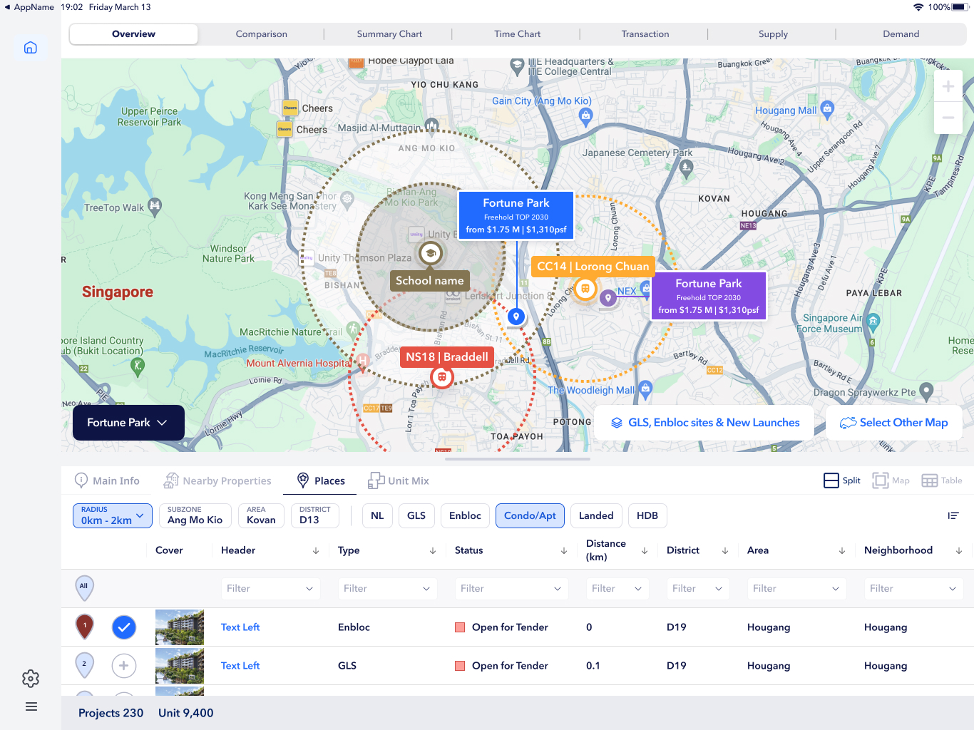
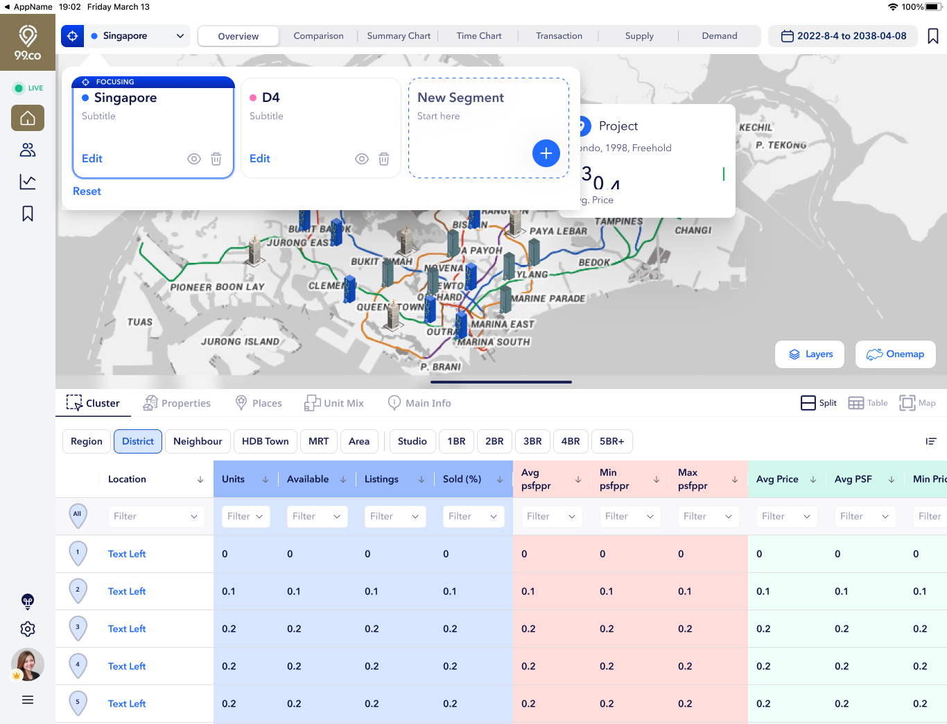
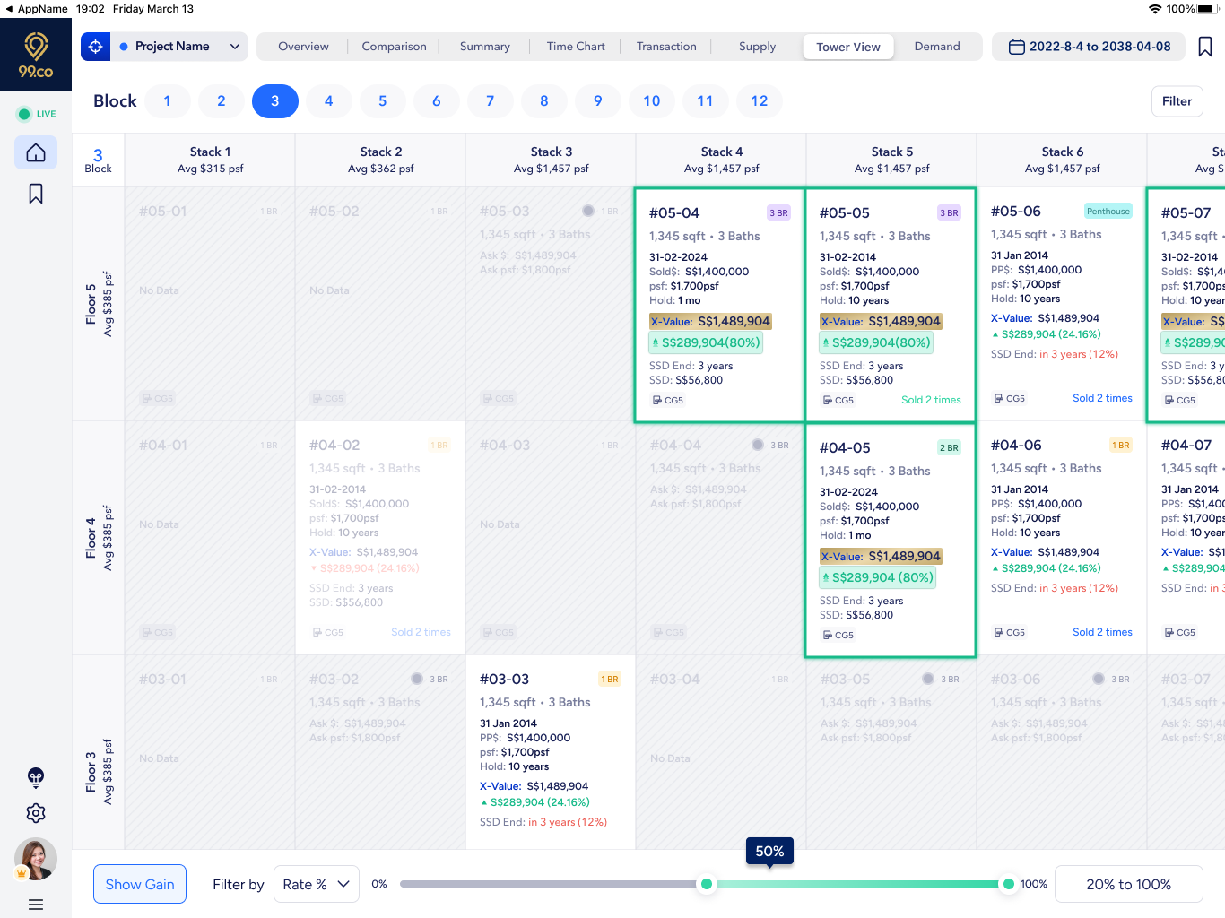
Putting the feature into mockup for presenting the high level product vision. Here are few major screens
Basic structure with map powered data reserch tool
Allowing user to search cluster level and single development level data
Visualising the data in different charts and tables
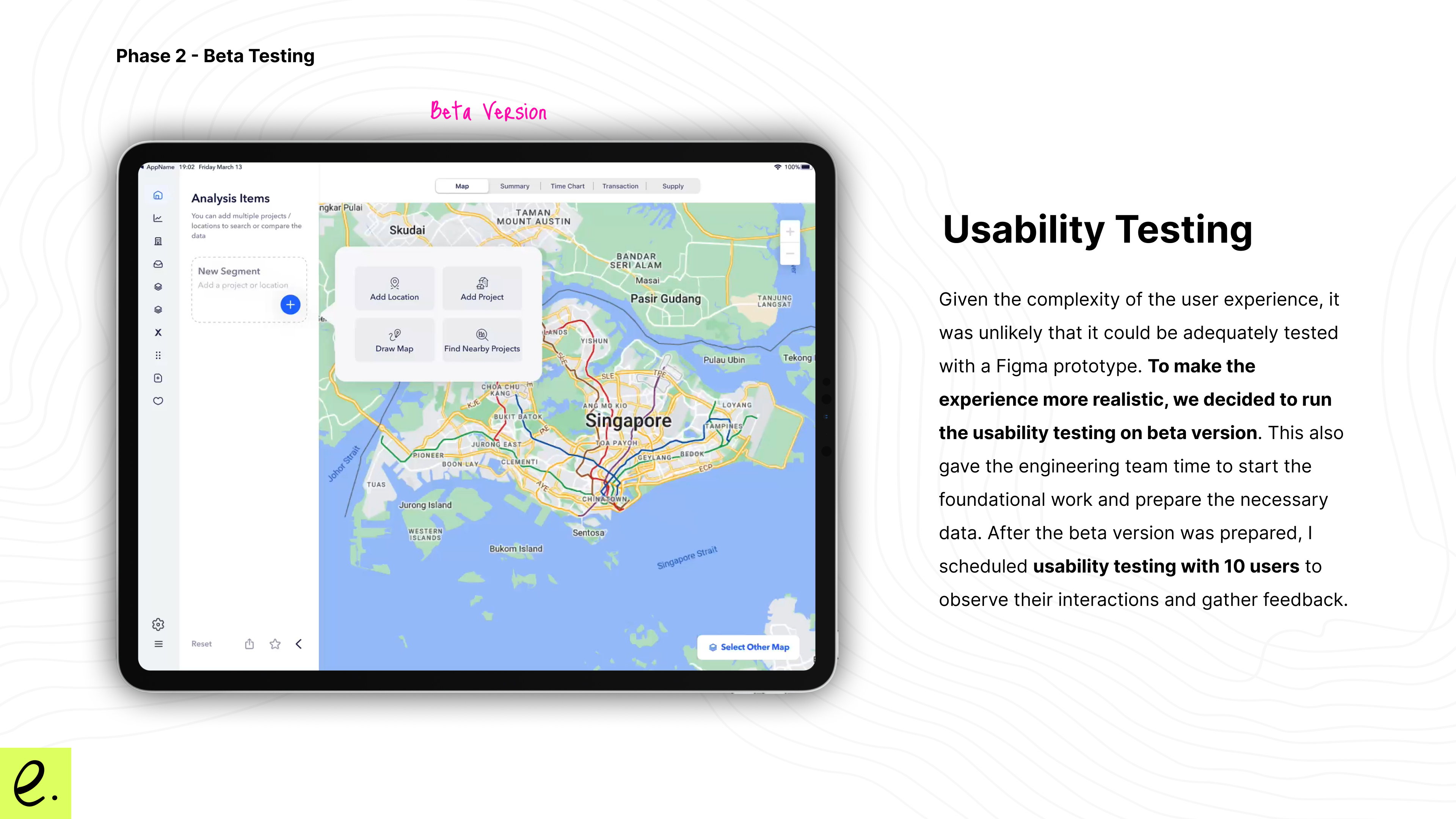
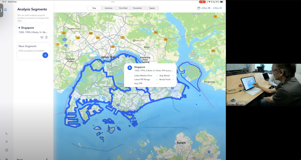
Phase 2: Beta Product and Usability Testing
Given the complexity of the user experience, it was unlikely that it could be adequately tested with a Figma prototype. To make the experience more realistic, we decided to build a beta version for usability testing. This also gave the engineering team time to start the foundational work and prepare the necessary data. After the beta version was prepared, I scheduled usability testing with 10 users to observe their interactions and gather feedback.
Usability Testing with an Active Agent
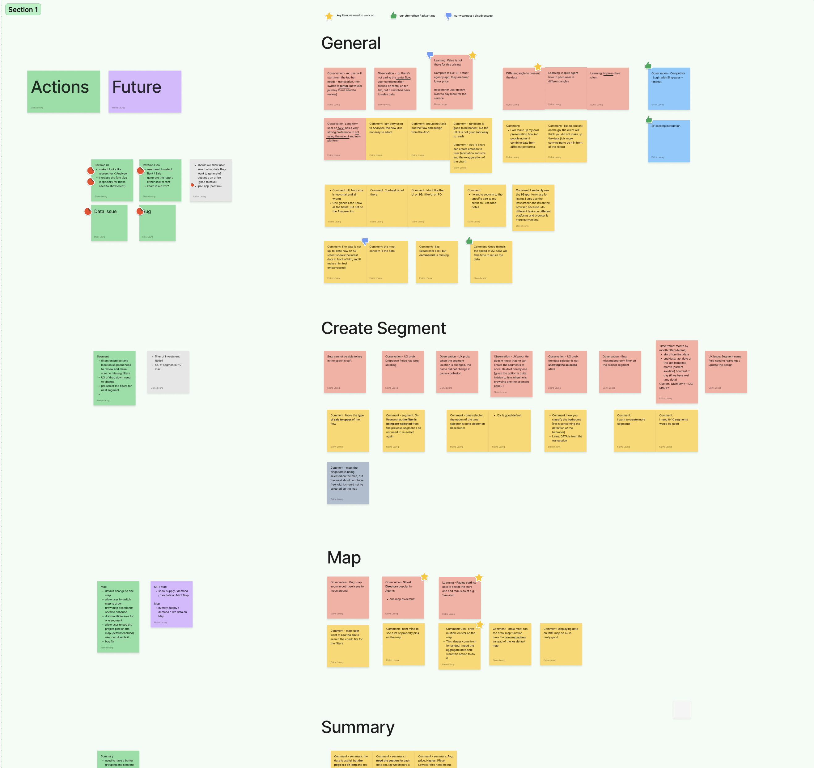
Mapping users feedback into different themes
Key Findings
Most agents prefer using the 13-inch iPad version to present data to their clients.
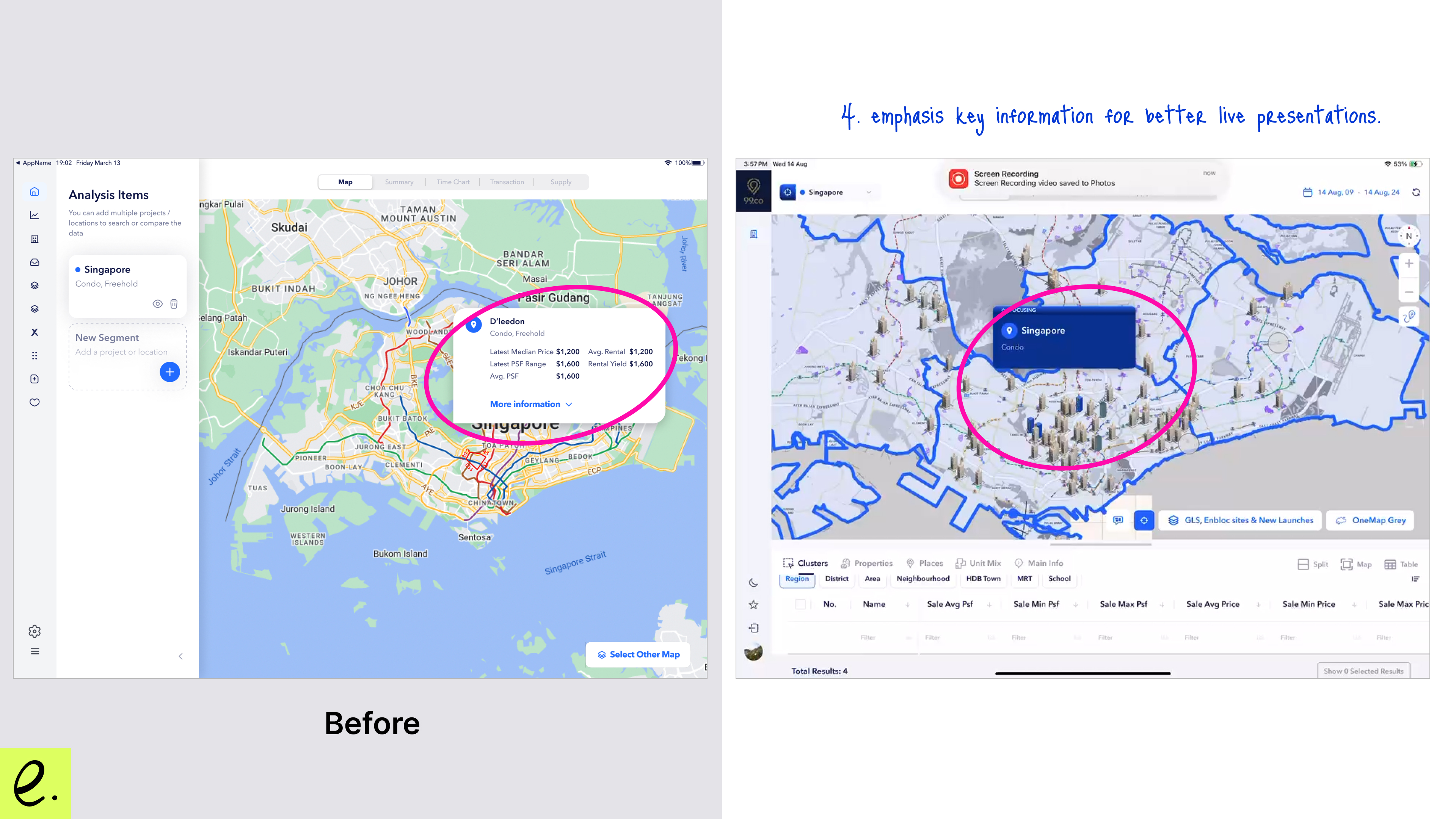
As the majority of usage involves presenting live data to real users, we need to increase the font size and emphasis on the most important information
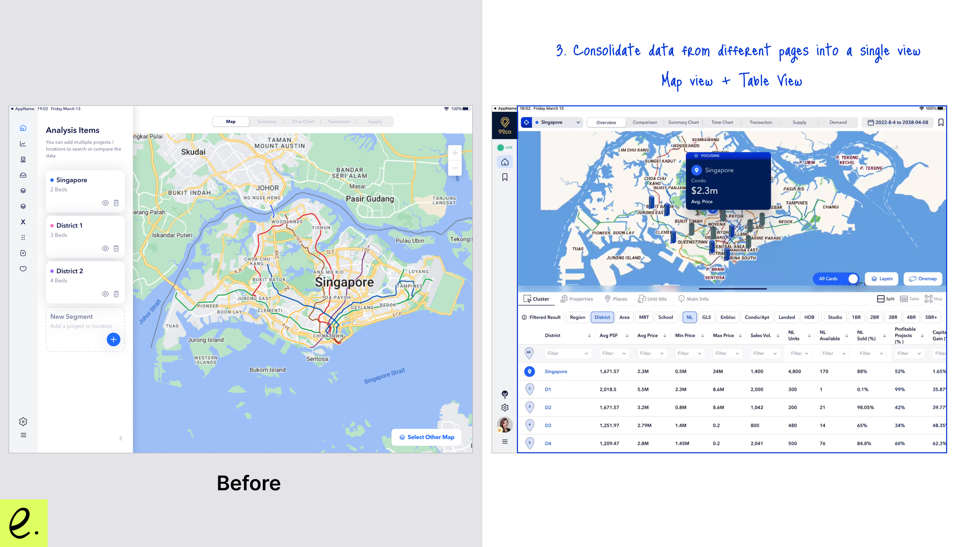
The data is still spread across different pages. Users want the ability to combine the information into one view and sort the data while seeing everything on the map.
Reminding myself - Presentation! Presentation! Presentation! This is the core value of this tool. We need to balance researching the data with presenting it effectively, ensuring strong visual cues, clear information hierarchy, and readability.
Phase 3: Refine and Product Launch
After the usability findings, we further refined the UX and UI. Here are some of the changes:
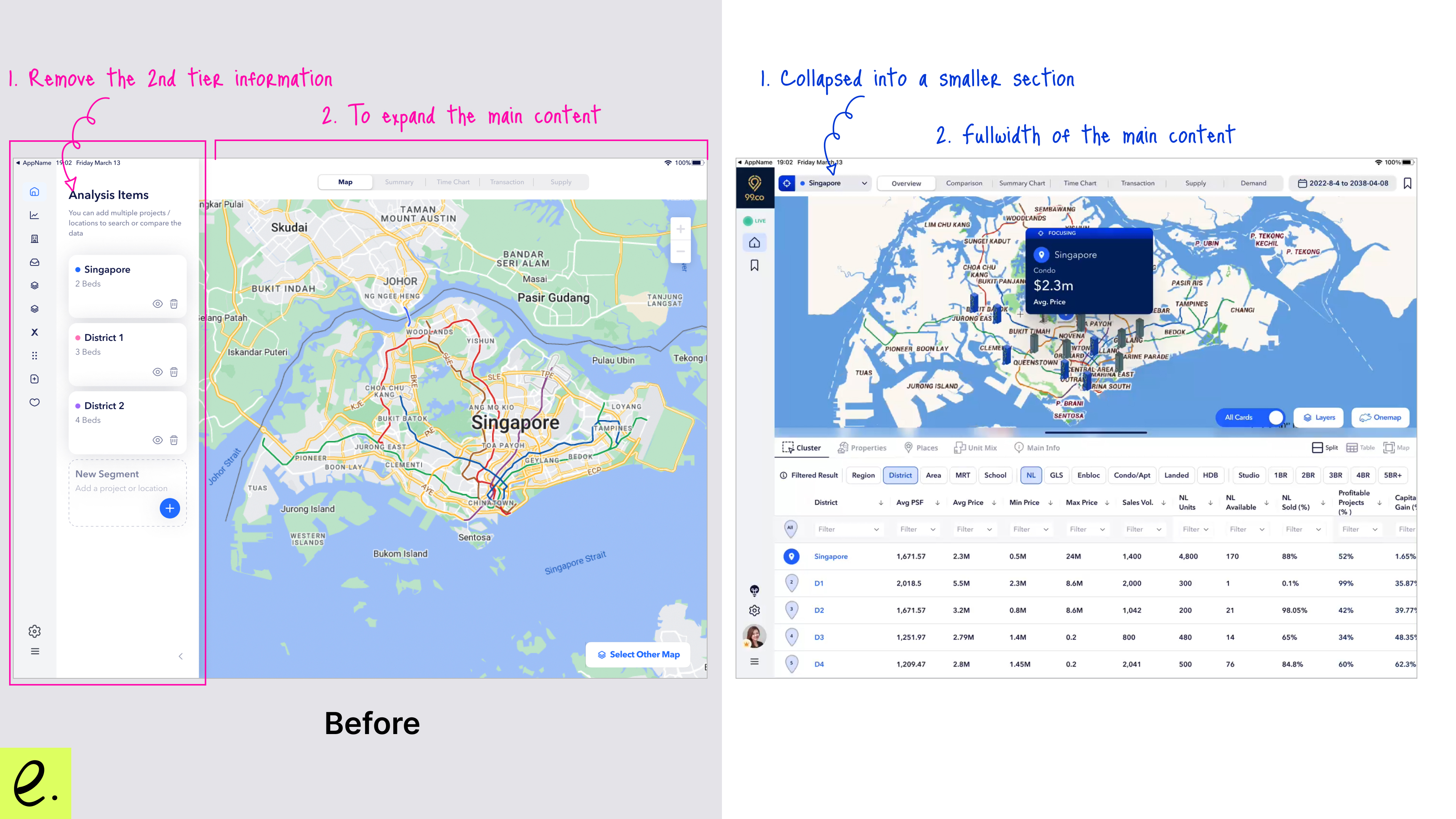
Before: As we learned from the agents, they need more space to display the most important data. The side panel was taking up about most of the space.
After: Considering the side panel are second-tier information, so I moved the side panel to the top left corner and collapsed it. This change freed up space and made the second-tier information less distracting.
Before: The information card was placed on both the side panel and the map, leading to redundancy and taking up too much space on the left-hand side. Additionally, the data presented on the map cards lacked clarity and did not provide a clear reading hierarchy or focus.
After: To improve readability and prevent users from jumping between different sections to find related data, I moved the cards from the side panel directly onto the map. This change also allowed us to present more relevant real estate data on the cards themselves. Additionally, we increased the font size to highlight the important data that agents want to emphasise.
Before: The map appeared very empty and took up 3/4 of the space without displaying any information. We missed a significant opportunity to populate the data.
After: We combined the table view with the map, giving users the flexibility to switch between full map view, split view, and full table view. By adding the table view, we can better present data on nearby properties and aggregated data from nearby districts. This is considered a new feature, as the data can now also be pinned on the map.
Few More NEW FEATURES!!
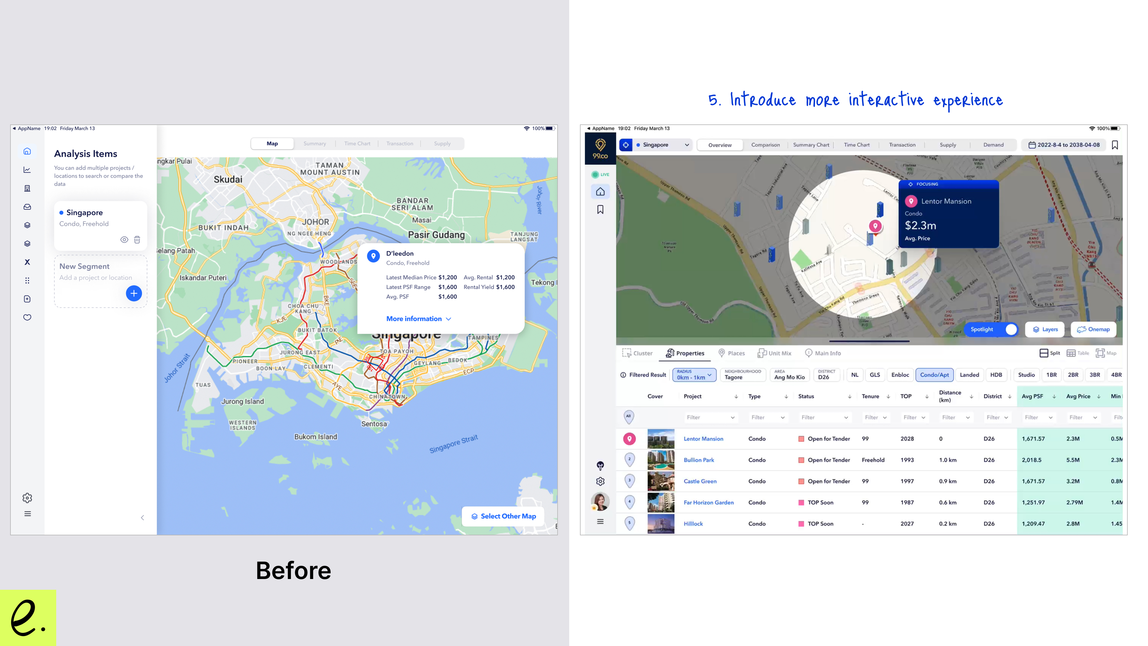
New Feature: Spotlight Mode - Allows users to spotlight information either on the map or on the table.
New Feature: Given the improvements to the overall map and table experience, we enabled users to pinpoint nearby stations, schools, and clinics. These are the most important factors for buyers when considering a property.
Before we started, as a product manager and designer, I recognized the limited resources available to our team. There were only four of us: one backend engineer, one iOS mobile engineer, one data operations specialist, and myself. Despite running numerous grooming sessions with prototypes and estimating the scope of each feature, we still ended up overrunning by two months. This was mainly because we needed to thoroughly test all the datasets we were presenting to agents and their clients. We had to take an extra month to fix the data and complete QA, which cost us time and caused us to lose momentum with our beta users.
In future projects, we should factor in time for testing and learning into our planning, and consider breaking the product into smaller phases to address each feature incrementally.
Learning #2: Real prototypes are sometimes needed for specific user groups
What I mean is that I typically run usability testing with Figma prototypes (clickable) and let users navigate through them. However, given the nature of this tool and this user group, there were challenges:
Complex Navigation: The tool has multiple starting points, and a clickable prototype isn’t ideal for capturing all scenarios and user interactions. Users often struggled to navigate the prototype and understand how to use it effectively, though they could grasp the features by reading the text.
Data Concerns: Since the tool is focused on data, agents are primarily concerned with how they interact with and interpret real data. Prototypes using mock data can be misleading, as users might get confused by random numbers that don’t accurately reflect the real-world data they’ll be working with.
Therefore, investing time to build a functional beta version can be more effective for real user testing and evaluating the presentation flow. Agents are a unique user group, and putting myself in their shoes helps me understand their needs better. Even if you alert them that the data is just a sample, they still need to interact with realistic data to assess the tool properly. The core user behavior observed is that presenting accurate data, along with clear labeling and explanations, is always a top priority for this tool.
Recommendation from Colleague
Elaine is one of those rare individuals where innate talent, pro-activeness and rigorous work ethic combine in a single person. The result of such is given enough time, Elaine will always find a way to learn what needs to be learned, and deliver on what needs to be delivered. Elaine was personally responsible for either the improvement or launch of nine of the products we had at 99.co, including our much-lauded product Researcher. This resulted in Elaine understanding and executing on each part of the product life cycle from conception to launch to enhancement to end-of-life. As the co-founder and CTO of 99.co, I was Elaine’s direct line manager when she became a Product Manager. I was gifted the chance to get to know her personally. What became clear to me from both her actions and our conversations was Elaine always cared. She cared about her colleagues; she cared about the quality of our work; she cared about our customers and the people who took a chance on using 99.co; she cared about whether 99.co felt like a special place to work or not. You could feel the effect of this in the meetings she ran, where that care converted into her product squad's enthusiasm for the roadmap ahead; you could feel it in the careful thought she put into her mentoring plans for other Product Managers, creating a more effective Product organisation;


.png)
.png)


